Not Fashion Related: Blogging 101
Do you love blogging your personal style but don't know how to get your blog off the ground?
You can join different blogging communities, read blogging sites and newsletters, join Twitter chats on the subject, read books on SEO, but some things are very very simple to get your blog to the next level and they are primarily cosmetic. I don’t know a lot of coding, I don’t play a lot with optimizing search engines, but I have learned with time basic changes that will not only help you get readers, but help you keep those readers. I know many of you have your own blogs and have been inspired lately to start blogs. I may not comment, but I do visit when I have time and I am so impressed with so many of your blogs and wanted to offer some easy “Blogger 101” tips to help you get your blogs more recognition. This topic isn't interesting to everyone, so I'm going to have a jump so the rest of you can keep scrolling to regular content.
Simplify Your Template
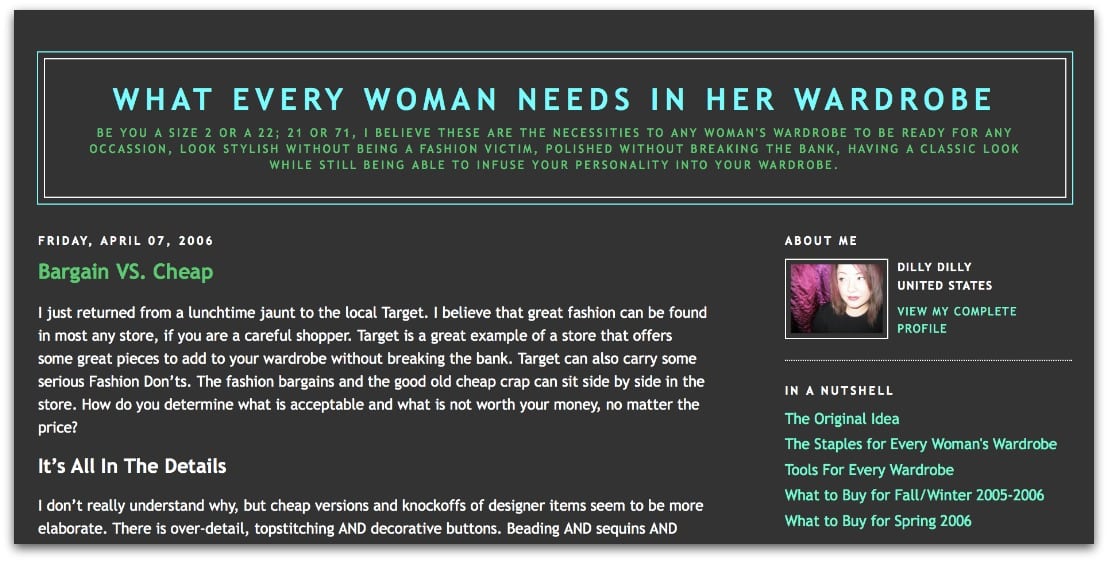
Get rid of the printed backgrounds, the Blogger fonts that are all pixilated, the headers that are three feet long, the centered text, and the 50,000 widgets in the sidebar. These days, a clean, white background with black or dark gray text is best. Don’t believe me? Check out all the “big” fashion and style bloggers, they all have clean, simple templates that are primarily white.
- Font. If you’re on Blogger, they have a bunch of fun fonts for headers and body text, but they are extremely hard to read. Choose something from the first category of fonts (classics like Georgia, Arial, Verdana) versus the Web Fonts which have more personality, but look very messy on most browsers and monitors. I use Verdana in 13pt. font for my body text, in a dark gray (#444444).
- Links. If you want people to click on your links to other pages or affiliates, make them visible and relatively appealing. I bold most of my links, because I have chosen a color with lower contrast to my regular text color. I used to have lighter links, but had individuals with vision issues tell me that there wasn’t enough contrast for them to see clearly. If you don’t want to manually bold each link, find a color that is obvious without being annoying (hello neon green, yellow, day-glo orange).
- Headers. Instead of the header that your blogging platform will make for you, consider making your own header. This terrified me for years until I started using online photo-editing software. Check out this post I wrote about PicMonkey, a free tool that can help you create graphics like headers. This is what I use for my header as well as all the graphic buttons in my sidebar.
- Get Rid of the Widgets. When you’re a new blogger you may feel that you have to fill up your sidebar, but it’s really not necessary. Have some navigation tools (archives, links to certain topics), and have ways to follow you (I’m not a fan of Google Friend Connect because it’s a big advertisement of how many people follow you, but am a mega fan of having a “subscribe by email” link as well as a link to popular subscription tools like RSS and Bloglovin). Also have simple links, not widgets to follow you on social media – your blog is advertising you, not Facebook.
Again, consider PicMonkey or another tool to create graphic buttons to organize specific topics – outfits, recipes, beauty reviews, red carpet recaps. Create an “about” where you have a picture and a bit about yourself (again create this, don’t use the Blogger widget).
- Learn Basic HTML. I was an English Lit major in college, and used a computer maybe twice while there, yet know enough about computers to work in Web Communications. How? Google. In 2003 I was trying to plan a wedding while working crazy retail hours and over 60 of those hours in a week. I needed to figure out how to get everything done at 2am or 11pm, so I learned how to surf the Internet, how to use Word and Excel to organize everything. I found The Knot, became obsessed, and through it created a bio which taught me simple HTML that I use to this day with my blog.
I encourage you to use Blogger to make links and upload photos, and then switch to the HTML tab of your new post and see the code. Copy it, paste it into Word so you can examine it more carefully. Consider creating a hidden second blog where you can play with code and fonts and templates without affecting your current blog. This is also a great way to upload photos to be able to use on your blog (I have a blog just for uploading images).
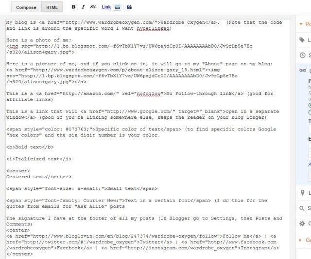
Here’s some very simple HTML coding to refine your posts and create your own sidebar widgets (click to see larger):
Make It Easy for Readers to View and Participate
- Do you have an RSS button? Can they easily follow you on Bloglovin? By email?
- Do you have your email address available? Readers like to contact you directly (as do advertisers and people who want to give you freebies!). I also created a Google Doc as a comment form and embedded it in a page so people can leave me feedback without having to email me directly.
- Have social media buttons or make your own so it’s easy to also follow you on Twitter, Facebook, Instagram, Pinterest, etc. If you don’t have these channels, no worries, but if you do be sure to promote so readers can get to know you better!
- Blogger makes it easy to have a footer or signature on each post. Go to Settings, then Posts and Comments where you will find a field to add content to every post. I have some to have people follow, and I just write my post above it.
- How is your commenting system? Blogger and WordPress have built-in commenting systems that aren’t very user friendly. It’s better to filter spam than have a captcha, which is especially hard to deal with on mobile devices. If you’re on Blogger and install Disqus for comments, turn off the mobile version for your site because the two don’t play nicely. Consider a commenting tool that lets people know when you reply to their comments so they will come back and take part in the discussion.
- Again, have a simple, clear, easy to read template. Some people may be reading on an iPhone, some may be on a netbook, some on a monitor from 1990. You don’t know, so keep it simple, keep it clean, keep it easy to read.
- Check Different Browsers. Your blog may look amazing in Internet Explorer, but be completely wonky on Firefox or an iPad. Every so often, open your blog in different browsers and make sure it’s lovely for all.
- Preview Your Posts. Before you publish, see how it looks in a browser. Do your photos spill into the sidebar? Are things crooked? Do you need more space between segments of content?
Improve Your Photos
- Consistent Width. One of my favorite features of PicMonkey is being able to easily resize all my pictures to the same width. You’ll notice in the past year or so, be the pictures horizontal or vertical, they are all 600px wide. This is kinder to your reader’s eyes.
- Consistent Size. A larger size makes it easier for people to see detail in what you are wearing. I chose 600px (which is far larger than Blogger’s XL option) after polling my readers and they telling me they wanted bigger. If your outfit photo only takes up a quarter of the screen and you’re an outfit blogger, you’re going to lose readers. People are there for the outfit, the inspiration.
- Consistent Quality. Try to get clear pictures (pictures taken outside will give better light and more natural coloring), switch up your poses so it’s not a scrolling wall of hand on your hip and ankles crossed, and believe in quality instead of quantity – better to have one good picture than one good and four blurry/unflattering/dark/strange. Honestly, you can have the best style in the world but if your pictures are small and dark people will not stick around.
- Get Rid of the Bling. No one wants the weird finishes, the rounded edges, the fake frames around your photos. Unless you have a very specific aesthetic to your blog (which you likely do not yet have if you’re still reading this post), these photo finishes are just muddling your message. Use something to color correct your photos, maybe a bit of text to state the brands or whatever (if that’s your thing), but otherwise keep it simple and clean.
- Use a Collage Tool. We know when you use Paint or PowerPoint to make your collages, it’s clear as day and is the electronic version of a craft project with cut up magazines and glue sticks. A while ago, I made a PDF for blogging friends on how to make customized collages, you can find it here.
- Give Credit Where Credit’s Due. If you use another blogger’s image, link back to that specific page in a caption below the image. If you want to use an image you found on Pinterest, find the original source and link to that instead. Don’t use images from news sources without permission – I know from experience that it can get you into trouble and cost you a pretty penny. I often use Polyvore for my images and link back to the set’s page so readers can see where I got my images.
Sites like http://www.tineye.com/ help photographers find where their images are being used without permission; http://jarred.github.com/src-img can also help you find who is the owner of an image you wish to use.
Don’t Get Caught Up in Blogging
I originally had a list of additional blogging resources, but I chose to delete them not because they aren’t beneficial, but they can take you down a blogging rabbit hole. It’s so easy to get so caught up with creating traffic and getting an audience that you forget the real reason why you started blogging.
Simple cosmetic changes to your blog are the equivalent to painting your front door, putting a planter on the stoop and adding a wreath. It’s still the same home and the same great people live in it, but sprucing up your entryway encourages people to come in, and makes people feel that you care about your home as well as those who are coming to visit.
However, just like a home, it’s not about where you got your couch or what you put on your coffee table, but the people and the love felt when you visit them. YOU are the blog, not the SEO or the header or the platform. Create a clean and welcoming platform to let your content sing, you never know your blog may change the face of blogging or be the next big thing!
Note: Most of this advice is geared towards those of you on Blogger. I see many new blogs are on this platform; I too am on Blogger so it is what I know best (and I obviously don't think you have to be on WordPress to be successful, nor does Altantic-Pacific or Keiko Lynn or many other big bloggers still on this platform). If you know of great tutorials specific to other platforms, please leave them in the comments to benefit your fellow bloggers!




Thank you for all the tips! I’ve been meaning to create my own header
ever since starting my blog more than a year ago, but I have no graphic
design skills or programs and no idea where to starthttp://www.yahafashion.net/
What a great post! I am excited to go read through your tips on making collages. I think that is what I struggle with the most. Oh, and I LOVE the idea of making all of my photos the same size. It drives me nuts in Blogger when my horizontal photos are such a different size than vertical. Definitely going to consider making them all the same pixel size. Thanks!!
Picmonkey is great — founded by people who were at Picnik before Google scooped it up.
Another tip: if you use a social bookmarking service like AddThis or ShareThis, the social sharing buttons are generated for you + you can track how often they’re used. Both have easy ways to be added to Blogger or WordPress sites, too.
True, that’s a good tip for those who have gotten to that point. I see so many who don’t even have a Twitter button and I know they’re on there. But yes, I like AddThis and ShareThis for easy buttons to add to each post to make it easy for readers to share posts on social media! 🙂 Thanks Heidi!
Bookmarking this for if/when I ever do a blog. Such good, practical helps, thanks.
What a nice, thoughtful, and kind post. Since I just gave my blog a new look and all my energies are focused now on selling our house in UP and buying a house in Denver area, my blog is going to have to coast for a few months. But I’m looking forward to ramping up again later this summer . . .
Thank you for all the tips! I’ve been meaning to create my own header ever since starting my blog more than a year ago, but I have no graphic design skills or programs and no idea where to start.
A question: Do you upload your photos directly to Blogger? I just read another blogger advising not to do that because it makes them less crisp; instead, to upload to Flickr and then insert that URL into the post. I have noticed that my pictures don’t look as good on my blog as they do on my computer, but I never considered that Blogger may be the problem. Your photos look great, but have you or anyone here had problems with that?
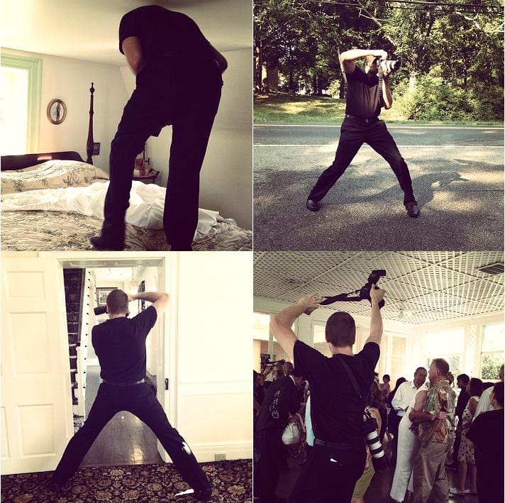
I upload directly to Blogger, always have. I’m not trying to be known for the est photography; my husband is super talented but we work with limited time for the shot, he doesn’t have editorial control, and PicMonkey isn’t as good as Photoshop and reduces the file sizes/resolution with editing. I also read that tip, but I just don’t have the time to stress over it and add that extra step. When you upload your pics to Blogger they are hosted on Picasa; I’ll be honest this is not my forte and I don’t know the true benefits of one over the other. What I do I think is fine, and it’s quick an easy for the novice blogger and coder.
Wow, lots of awesome advice to digest! I’ve just started on WordPress and am learning my way ’round the technical bits like formatting photos, adding widgets etc. It still looks pretty amateur, but I’m improving it bit by bit as I learn.
I’m on http://birdybegins.wordpress.com/ in case anyone reading as any feedback?